MINIMALIST PORTRAIT ILLUSTRATION DIY TUTORIAL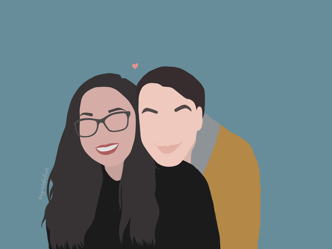
Couple Hugging Portrait 2020
Over the pandemic, there have been a few changes happened in my life. Though wedding calligraphy works has been slow, I picked up on new skill set that I have seen a lot lately on Instagram: minimalist portrait illustration. Let’s find out what it takes to show case your favourite photographs using this simple, yet very intricate style of illustration.
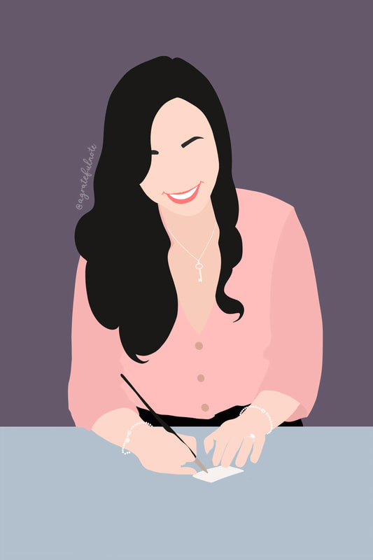
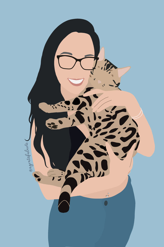
Minimalist portrait illustration is a trendy art style where only few features of the subject are captured. Eyeless face, flat colours and vector like features are some of the characters this style is made up of.
​Even though it looks simple, it needs a lot of attention to layering and requires patience in the touch up process. In my portrait, I usually emphasize the subject’s eyebrows and lips on the face, shape of the hair flow and colour of clothing. I tend to leave the background as one solid colour to bring the focus to the subject. If the subject wears glasses or jewelries, including those accessories will help to add personality to your illustration. In this quick guide, I would like to show you how I create my illustration using my iPad, Apple Pencil and Procreate software. Procreate also work on newer generation of iPhones by using stylus as well. What you will need:
Steps to create a minimalist portrait: 1. Select colours: From your reference photographs, use colour picker and select the closest colours from photo of the skin, hair, clothing and accessories of the subject. You could also make a range of colour and choose the one that fits the most on your final version. Colours can be changed in the touch up process so don’t worry about choosing the right colours the first time. Code those colours down for reference later in a separate layer. 2. Break down the features: Break down your subject’s anatomy using simple shapes. Organic subjects are the easiest in my opinion as the shapes are more forgiving. I usually break the features down to face, hair, eyebrows and lip, neck, top, bottom and shoes (if applicable). This is a good time for you to study the order of the subject’s features and use it to your advantage in the next step. 3. Outline and layers: The secret to the success of these illustrations is layers. Each shape should be isolated to individual layer and named appropriately. Doing so would help you when it comes to time to change colour of your shape. *For example; when illustrating face, put the layer where the skin colour underneath the layer of eyebrows and lips. That way; when needing to adjust or change the skin colour, it won’t affect the eyebrows and lips area vice versa. Be mindful of the order of your layer to get the best reflection of likeness for your illustration. Sometimes, you would need multiple layers for one feature. I would recommend keeping it flat with the least amount of details for the best result (flat colours only). Practice with 1 subject photograph before moving on to multiple subjects. 4. Fill in colours: When drawing these shapes, use monoline brush to outline and you must touch the starting point and the ending point to close the shape. You must do this to fill in the area with colour without filling the canvas. Think of this step like MS Paint (if you are old enough to know this program like I do): if there is a gap in between your line, the whole canvas will be filled with colours. To fill the shape with colour, select the colour and drag/ drop it into the shape. Sometimes, when the shape is not large enough for the fill in feature, manually filling it in with your monoline brush would also do the job. Tips: I always have separate layers for the face and neck. I also select the face colour and adjust it to a shade or two darker for the neck area to create depth. Don’t worry if your shapes are not perfect and have gaps. The next step will bring your illustration together: touching up. 5. Touch up/ Change colour: Touch up is the most time consuming process and ÂÂÂÂcomes in 2 parts: adding to the shape using a fine liner brush and reshape using the eraser tool. When touching up the shape, zoom in closely at the area between each shape/ colour. Smoothing out the edges using the eraser tool. Ensure all the colour of touch edge by filling in any gaps. You can adjust each layer colour to fit your illustration style. This process takes practice but it will be worth it in the end when your illustration is consisting with clean lines and colours. 6. Sign your illustration with your logo or signature: I usually draw my handle (@agratefulnote) on my illustration to sign it. You could also use software such as Adobe Photoshop and Illustrator for minimalist illustration as well. I prefer using my iPad as it is portable and suitable for working while traveling. These illustrations can be turned into: wedding invitation, wedding thank you card, birthday card, decorative print or simply just your own personalized profile photo. I also have an IGTV video on Instagram showing a glimpse of how I put together a minimalist portrait. Please tag me #agratefulnote when you try out this tutorial. I cannot wait to see the beauty this simplistic style could offer to your photographs.
If you want to hire me for your minimalist portrait illustration, click here
3 Comments
Vaibhav
12/12/2022 00:47:27
Hey I just searched minimalistic illustration and found that portrait and just clicked to check the website ! I just started with it and like the method you share which has guided me to how to make it more soothing and better my art^_^
RV
7/1/2024 18:53:26
Thank you for the wonderful tutorial. It is very helpful for beginner digital artists to have such a detailed guide on this style of illustration. Leave a Reply. |