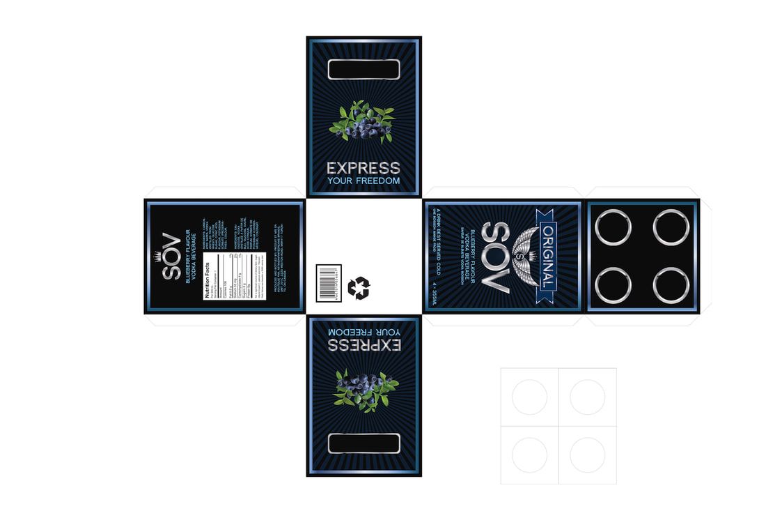
SOV - Branding bottle label packaging design
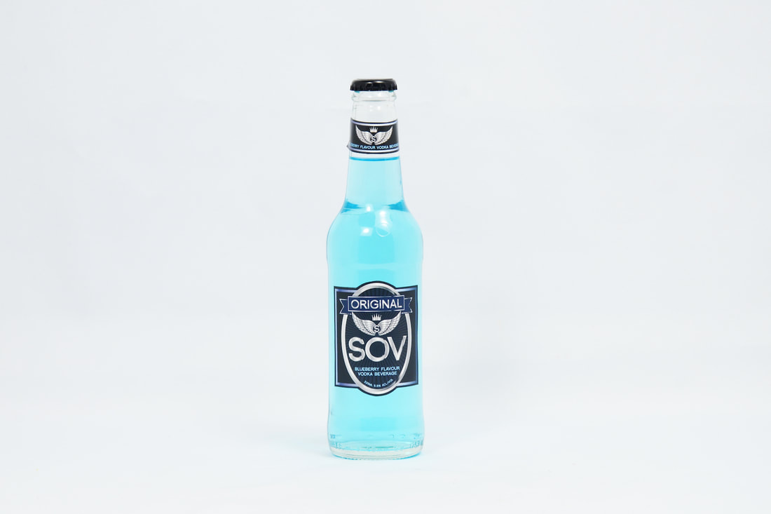
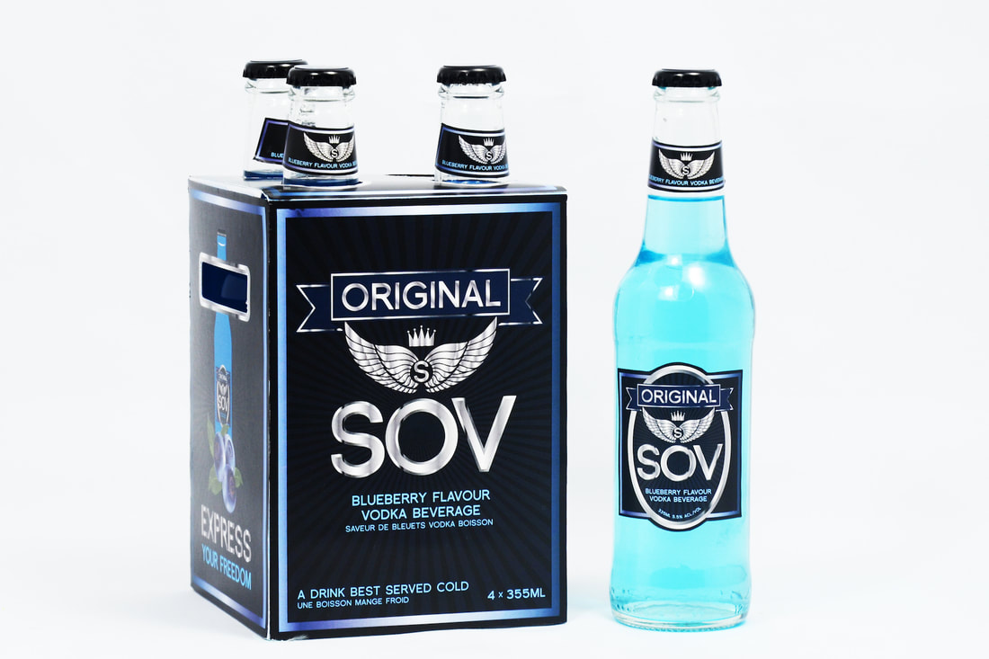
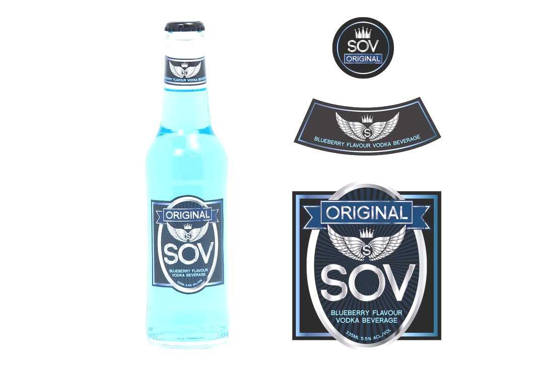
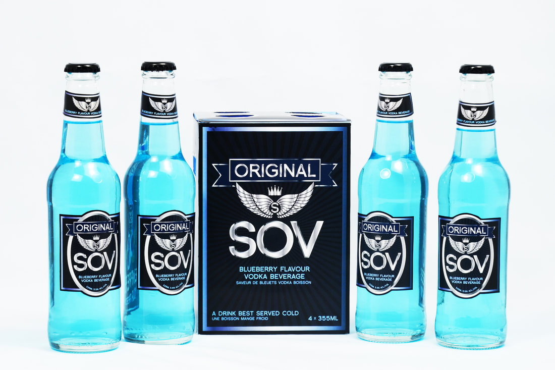
I designed the branding and packaging for a blueberry alcoholic beverage for a school project. SOV is a brand of vodka cooler that named after the Black-naped Monarch. SOV stands short for “sovereign” and it presents freedom and power. The bird itself is blue in colour with black details. The design of SOV is based on the look of the Black-naped Monarch.
The chrome, metallic rings surrounded the details of the brand is created to fit the personality and the target audiences (male, age 19-25). Blueberry vodka beverages always have distinctive designs that differentiate itself from other alcoholic drink. Instead of the golden banners and rings for beers, vodka beverages carry a silvery accent. The blue colour of the body copy is also chosen correctly to be visible on a dark background. Overall, the design is successful because it fits the personality of the alcohol type and the group of target audiences. This design was displayed on the hallway of George Brown College - School of Art and Design for 2014 - 2015 semester.
The chrome, metallic rings surrounded the details of the brand is created to fit the personality and the target audiences (male, age 19-25). Blueberry vodka beverages always have distinctive designs that differentiate itself from other alcoholic drink. Instead of the golden banners and rings for beers, vodka beverages carry a silvery accent. The blue colour of the body copy is also chosen correctly to be visible on a dark background. Overall, the design is successful because it fits the personality of the alcohol type and the group of target audiences. This design was displayed on the hallway of George Brown College - School of Art and Design for 2014 - 2015 semester.

